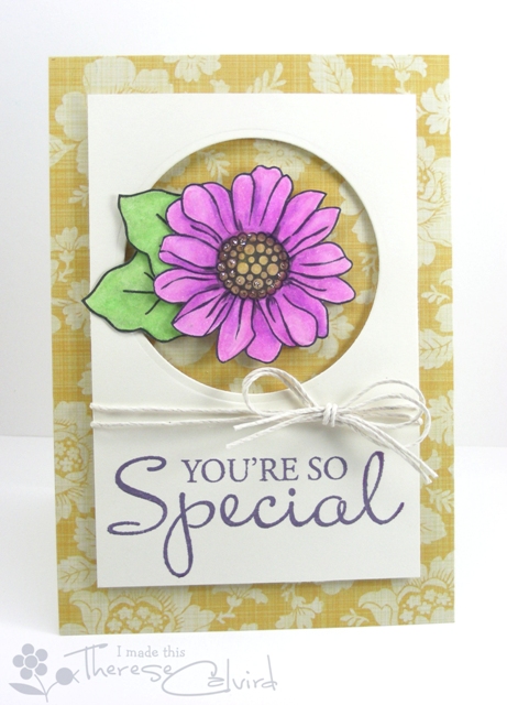
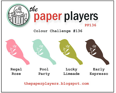
There’s still time left to place a $50 order and get a free Sale-a-Bration 2013 item! Up until March 22, one of the 19 free items you can pick is SU Vintage Verses. I used this set with the flower from SU Oh, Hello and SU Just Thinking single stamp, both in the Spring Catalog 2013. I was inspired by the circle focal image of a flower on Therese Calvird’s card at the Muse Card Club #8 . The colors from The Paper Players #136 and the sketch from Fab Friday # 13 also helped me design this pretty note card:

Card Recipe:
STAMPS: SU Vintage Verses, SU Just Thinking, SU Oh, Hello
INK: SU LuckyLimeade, SU Early Espresso, SU Regal Rose, Versamark with embossing powder
PAPER: SU Early Espresso, SU Regal Rose, SU Pool Party, SU Early Espresso from Neutrals Pattern Stack
ACCESSORIES: SU Pearls
TOOLS: SU Decorative Label Punch, SU 1 1/4 in. Square Punch for banner, SU Windows Collection Framelits, SU Stampin’ Dimesionals, Nestabilities Circle die

Item # 129636 Clear, 129633 Wood-mount


The layering is great on this card… the clean cuts and colors are just beautiful! Thanks so much for sharing with us at Fab Friday!
Thanks so much, Pam. I loved the sketch this round- it really helped in designing the card;)
I love the clean lines on this card! The Espresso paired with the spring colors really pop! Great “just because” card! Thanks for sharing with us at Fab Friday!
Thank you, Amanda. I just thought how this could be an Easter Card with the spring colors…hmmm.
What a gorgeous combination of stamped images here! Love all the layers to your focal element and you’ve combined the colors perfectly! So glad you joined my color challenge at The Paper Players!
Thank you, Nance. I really fell in love with the colors once I laid them out on my desk. Once I started, I kept pulling out more stamp sets…lol.
Great take on the challenge, Cindy. I love that you kept the Espresso layer so clean and then brought the same color to the sentiment. I love the little pop of pink on the flower, too and the double banner is right on trend. So glad you joined the Paper Players this week
jaydee
Thanks, Jaydee. I had fun with this card for sure. I always forget to use my trusty brown palette!
Love all your layers and the layout, Cindy. The colors really pop against the brown background. Thanks for sharing your creation with The Paper Players!
Thanks, Sandy. I almost embossed the espresso background, and now I am glad I didn’t.
Love these colors!
Thank You, Bonnie. I fell in love with these colors too!
Wow–this is gorgeous!
This is a stunning card. Your layered labels are perfect!